%202.gif)

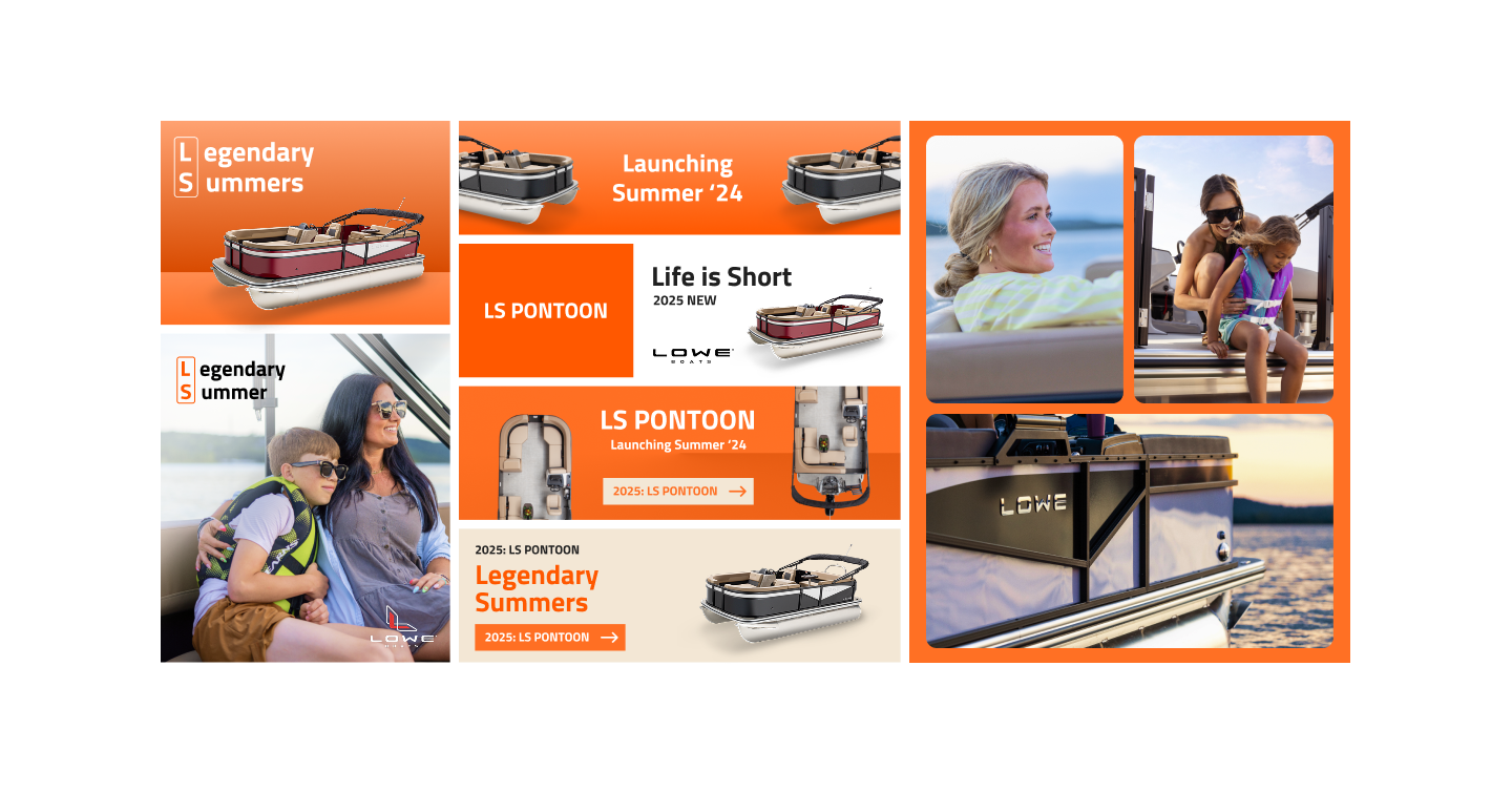
Most boat launches focus on specs: horsepower, seating, paint swatches. But the LS Pontoon wasn’t just another model in the catalog.It was Lowe’s chance to reclaim the value pontoon market—to prove boating can be stylish, social, and affordable.The challenge? The name was just two letters: LS. On its own, uninspiring. Forgettable.My role as lead designer was to transform LS from a bland alphanumeric label into something people could feel, remember, and rally around.
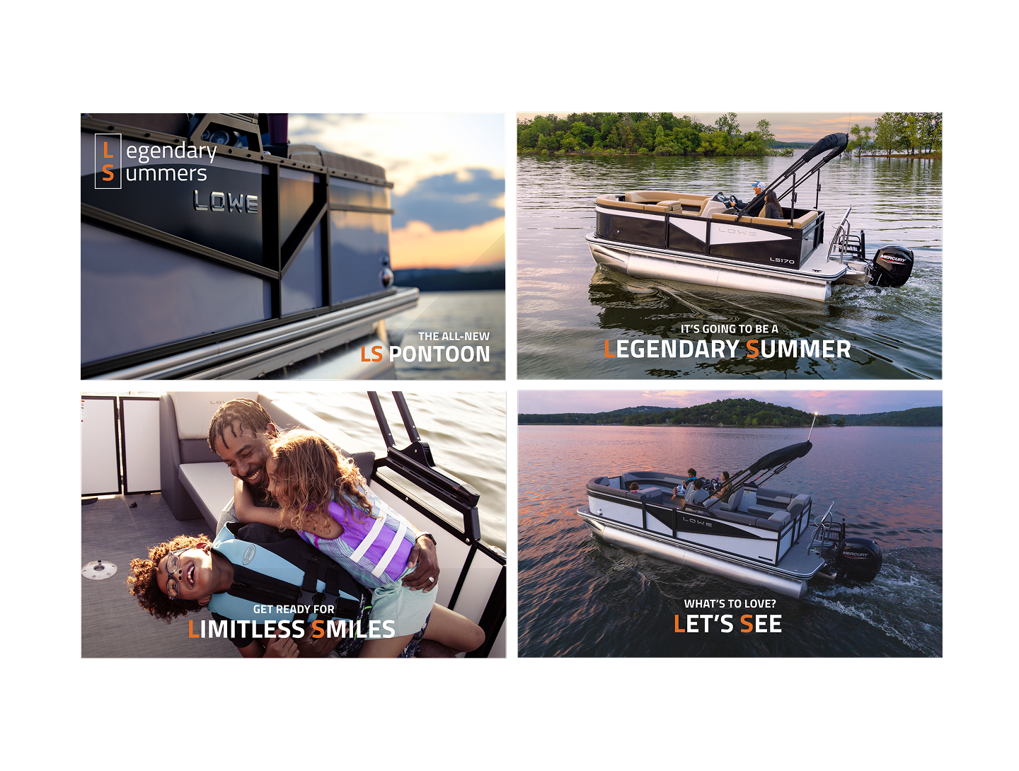
- Brand Storytelling: Developing LS meanings (“Long Summers,” “Life is Sweet,” “Limitless Smiles”) to humanize the product.
- Visual Identity: Designing the LS rectangle lockup, typography, and mood-driven photography.
- Consumer Connection: Lowering barriers for new boaters, aligning campaign with human-centered insights.Integrated
- Campaign: Ensuring every touchpoint—digital, print, and social—reinforced the lifestyle narrative.
- Rebrand LS from a forgettable alphanumeric name to an emotionally resonant lifestyle symbol.
- Showcase the pontoon as stylish, social, and accessible—appealing to first-time boaters.
- Create a narrative framework that could flexibly communicate different facets of summer, fun, and togetherness.
Consumers weren’t asking for a new pontoon name—they wanted:
- More fun days with family
- Affordable weekend escapes
- A lifestyle that feels like it belongs to them, not just the luxury few
Market gap: competitors over-indexed on luxury, leaving huge opportunity for value + style
Consumer psychology: New boaters often feel boating is “out of reach.” Campaign needed to lower the barrier
Brand alignment: Lowe listens to its community. Campaign amplified this: “We hear you. We ARE you.”
Transform LS from bland alphanumeric letters into a flexible narrative system
Evoke fun, approachable, and aspirational feelings through design
Make the pontoon feel accessible without undermining style or quality
Create assets that could live across multiple media while keeping lifestyle at the center
Instead of running from the plainness of the name, we leaned into it.
Long Summers → endless days on the water
Life is Sweet → celebrating simple pleasures
Limitless Smiles → joy without barriers
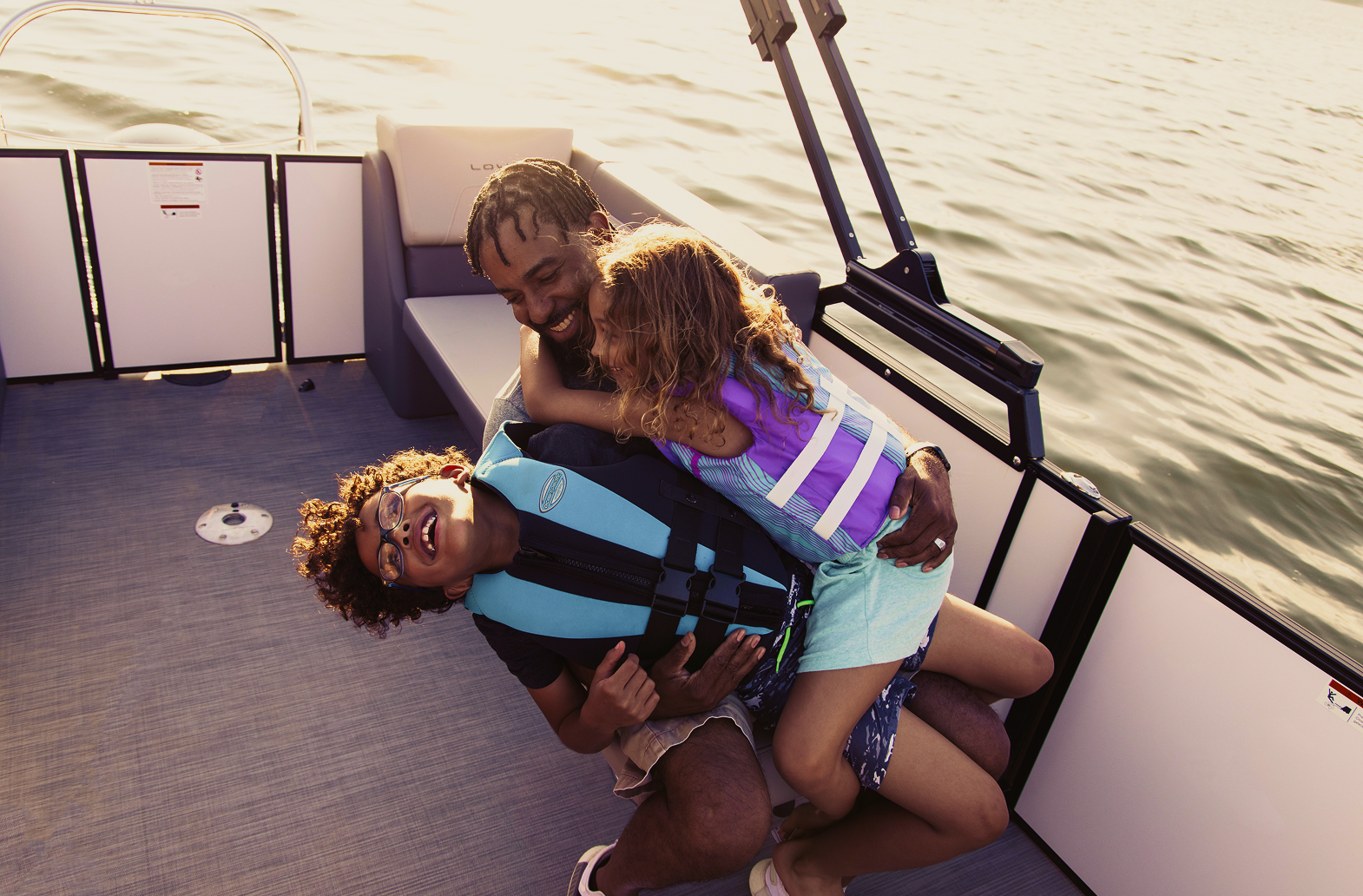
As part of the creative direction, I developed both the moodboard and the storyboard for the LS photoshoot. These guided the production team on how the campaign should look, feel, and emotionally land once we moved into real-world shooting.I set the tone around a warm, lifestyle-driven visual language—sunset hues, natural light, candid expressions—capturing the essence of summer on the water. This visual warmth aligned directly with the LS narrative of Long Summers, Life is Sweet, and Limitless Smiles.
- Real families laughing and relaxing
- Kids and parents sharing moments (mom + son, dad + daughter, etc.)
- Friends hanging out, talking, enjoying the rideBoats in motion—spray, movement, wind, energy
- Genuine smiles and interactions, never overly staged
- Scenes that feel like memories, not advertisements
.png)